- Marketers should utilize Google Analytics 4 and heatmapping software to analyze scroll depth and identify high-engagement zones for precise call-to-action placement within long-form content.
- Combining contextual anchor text links within the narrative and high-visibility buttons in the introduction or conclusion can significantly increase click-through rates and B2B lead generation.
- Aligning call-to-action offers with the reader's journey—using low-friction tools for the awareness stage and high-value offers like product demos for the decision stage—maximizes conversion potential.
- Implementing mobile-first design principles such as sticky footers and optimized touch targets ensures that conversion points remain accessible and user-friendly for mobile visitors.
- Utilizing dynamic and personalized CTAs based on visitor history or geographic data can boost conversion rates by over 200% compared to standard static offers.
Strategic call-to-action placement involves positioning conversion points where they align most naturally with a reader's journey through a long-form article. It's about moving beyond simple buttons at the top of a page to create a seamless path for users who are consuming informational content.
The goal's to maximize signups and lead generation without interrupting the learning process or alienating visitors. This approach relies on three main pillars, which include placement based on scroll depth, contextual relevance, and the specific format of the offer. Keep reading to learn more about strategic CTA placement.
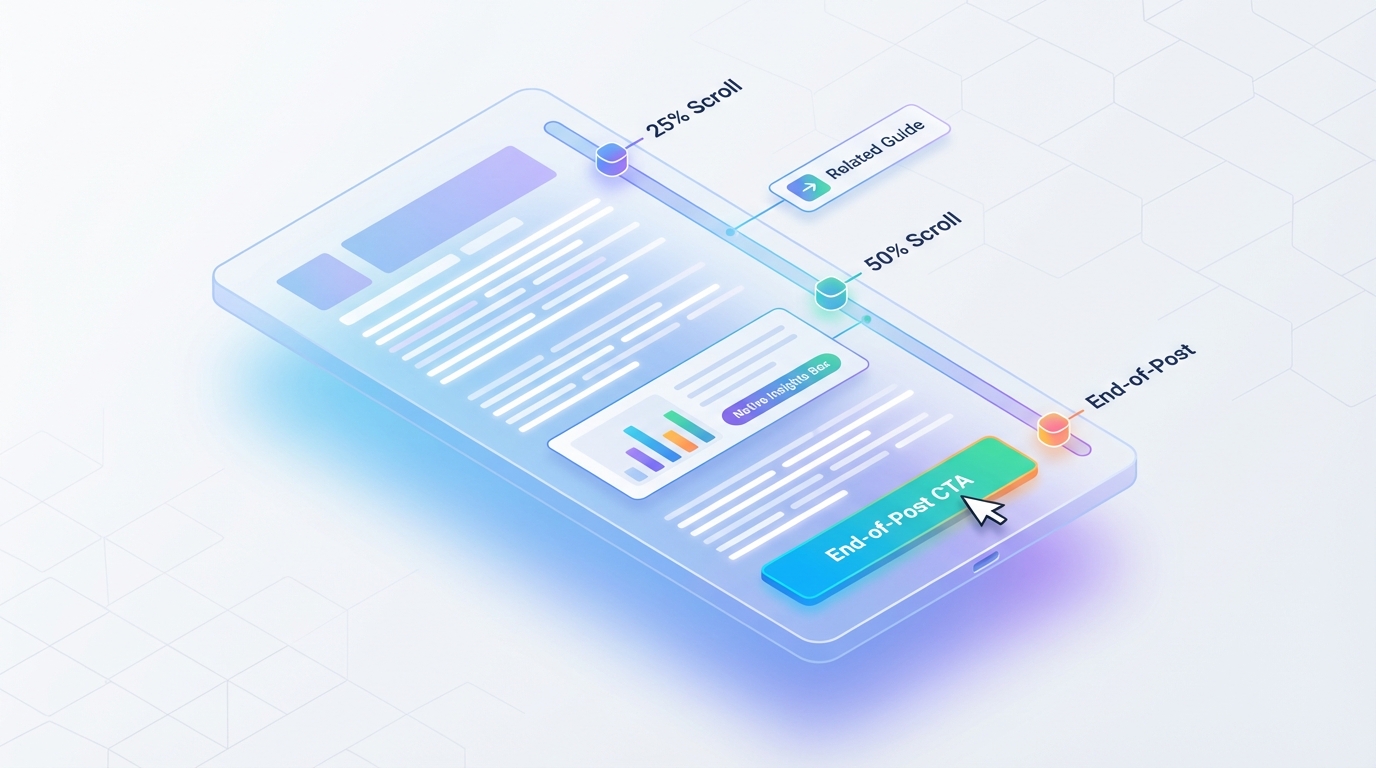
The Science of Scroll: Mapping CTA Placement to Reader Engagement
Effective placement relies on data rather than simple intuition or aesthetic preference. By mapping calls to action to specific points of reader engagement, brands can ensure their offers appear when a visitor's most receptive. This data-driven approach allows for a more sophisticated marketing strategy that respects the reader's time while maximizing conversion potential.
SaaS founders and SEO strategists often look for ways to improve B2B lead generation through long form content. The average conversion rate across all websites is roughly 2.4%, but the top 10% of websites convert at 11.5% or higher. Achieving these top-tier results requires a deep understanding of how users interact with long-form text.
One company even achieved a 12% increase in visit-to-lead conversions by specifically optimizing their scroll depth and above-the-fold content. This proof shows that understanding where a user's eyes actually rest can change the financial outcome of a content campaign. Marketers should focus on identifying these high-engagement zones before deciding on a final layout.
Engagement data helps content marketing managers justify their production budgets to executive leadership. When you can show exactly where users stop reading, you can fix the friction points that prevent signups. This level of technical nuance is what separates a basic blog from a high-performing conversion engine.
Why Generic Placement Fails Long-Form Content
Standard placement rules often suggest that the most important information should sit above the fold to capture immediate attention. While 156% more people see content at the top of a page compared to other locations, this doesn't always translate to higher conversions in long-form guides. High-intent visitors might click early, but most readers need to understand the value of the information before they're willing to commit.
Many businesses fail to capture these leads because they don't provide a clear path forward as the reader progresses. It's a significant missed opportunity, especially considering that 70% of small business B2B websites lack a call-to-action entirely on their pages. Relying solely on a single hero button misses the vast majority of engaged readers who only become ready to convert after absorbing several sections of educational material.
Generic placement often falls victim to banner blindness, a psychological phenomenon where users subconsciously ignore anything that looks like an advertisement. This filter helps users focus on the content they came for, but it makes traditional sidebar CTAs nearly invisible. To overcome this, marketers must integrate their conversion points more naturally into the central reading column.
Analyzing Scroll Depth to Pinpoint Conversion Moments
Google Analytics 4 offers built-in ways to measure how far down a page a visitor actually travels before leaving. By default, GA4 tracks scroll events at a 90% threshold, but custom events can track engagement at the 10%, 25%, 50%, and 75% marks. Monitoring these specific increments allows marketers to see exactly where the largest drop-off in attention occurs.
To implement this in Google Tag Manager, you should create a new trigger based on Scroll Depth. You can then set specific vertical scroll percentages to fire an event back to your analytics dashboard. This data shows you the exact paragraph where most readers lose interest, allowing you to place a transactional content offer just before that exit point.
A good scroll depth typically ranges between 60% and 80%, which indicates that users are finding the content relevant and engaging. If data shows a significant exit rate at the 50% mark, a strategically placed CTA at that point can re-engage the reader. This placement serves as a bridge, offering a related resource that keeps the user within the brand's ecosystem.
Using heatmapping software alongside scroll tracking analytics provides an even clearer picture of user behavior. These tools show where users linger and what elements draw their visual attention as they move down the page. Combining these insights allows for the precise placement of conversion elements at the exact moment a reader reaches peak engagement.
The Power of the End-of-Post CTA
The conclusion of an article represents a moment of peak trust because the reader has consumed the entire piece of content. This placement targets the most dedicated individuals who've already absorbed the provided value and are now looking for the next logical step. Because interest is at its highest point here, the offer should be the most direct and high-value conversion goal available.
A B2B company saw a 738% increase in conversions by optimizing CTA convenience for their lead-generation landing page. This same principle applies to the end of a long-form post, where the user shouldn't have to search for a way to contact the company. The end-of-post CTA should be distinct and visually prominent to ensure it catches the eye of everyone who reaches the final paragraph.
At this stage, the reader has likely been convinced of the brand's expertise and is more sold on the topic than they were initially. This reader is much more likely to respond to a mid-funnel offer like a deep-dive report or a webinar registration. It's the perfect time to ask for a larger commitment because you've already demonstrated significant value through the preceding text.
The Psychology of CTA Copy
The words used on a button or link are just as important as the physical location of the element. Copy should focus on the benefit the user receives rather than the action they have to take. For example, using "Get My Free Guide" often performs better than a generic "Submit" button because it emphasizes the reward.
Low-friction copy is essential for readers who are still in the early stages of the awareness funnel. A CTA that says "Download the Checklist" feels much safer than one that says "Schedule a Call" to a first-time visitor. You're building a relationship of trust by offering small wins before asking for a significant investment of their time.
Psychological triggers like scarcity or urgency can also be effective when used sparingly in long-form content. Mentioning that an offer is only available for a limited time or to a specific number of signups can increase click-through rates. However, these tactics must be used honestly to maintain the brand's long-term credibility with its audience.
Mobile-First CTA Design and Placement
Mobile devices require a different approach to design to ensure that CTAs are usable on smaller touchscreens. Buttons should be large and easy to tap, following accessibility guidelines that suggest touch targets should be at least 48 by 48 pixels. This size corresponds to approximately 9 by 9 millimeters, which is the standard for comfortable thumb interaction.
Using contrasting colors and plenty of whitespace around these buttons ensures they stand out without cluttering the screen. On a mobile device, a sticky header or footer can keep the primary CTA visible without interfering with the reading experience. This persistent visibility is important because mobile users are often more prone to distractions.
Marketers should consider thumb-zone mapping when placing elements on a mobile screen. Most users navigate with their right thumb, making the bottom-right and center-bottom areas of the screen the easiest to reach. Placing your most important conversion buttons in these zones reduces the physical effort required for a user to sign up.
Load speed is also a critical factor for mobile conversions in long-form content. If a complex native CTA or heavy image-based button slows down the page, users will likely bounce before they even see it. Optimizing your site for speed ensures that your conversion points are ready to be used as soon as the reader reaches them.
Form and Function: Choosing Between Text, Button, and Native CTAs
Once you've determined where to place your conversion points based on engagement data, you must choose the right physical format. The physical appearance and formatting of a call to action significantly influence how a reader interacts with it. Choosing between text links, buttons, or native elements requires an understanding of how these formats impact the visual flow of a piece.
The bridge between data and design is understanding which format matches the user's intent at each specific point. If a reader is deeply immersed in a technical paragraph, a bright button might be too jarring. In contrast, a text link can feel like a natural extension of the learning process without breaking the reader's focus.
It's important to test how different formats perform on optimizing SaaS blog posts for signups across various device types. What works on a desktop might feel intrusive on a smartphone, so flexibility in your design is key. This careful selection ensures that your conversion strategy supports the user experience rather than fighting against it.
Contextual Anchor Text CTAs vs. High-Visibility Buttons
Anchor text links are effective because they blend into the narrative and provide a contextual next step for engaged readers. These links feel less like an advertisement and more like a helpful resource or a natural continuation of the current topic. HubSpot achieved a 121% increase in conversion rates by adding anchor text CTAs to 80 of their high-traffic blog posts.
While text links are great for maintaining flow, buttons are better for driving immediate action in specific sections. There's a 28% increase in click-throughs when using a call-to-action button instead of a simple text link in many marketing contexts. Brightly colored buttons create a clear visual break that signals a transition from learning to acting.
The best strategy often involves using a combination of both formats throughout a long-form article. Use anchor text links in the body paragraphs to offer supplementary information without breaking the reader's concentration. Reserve high-visibility buttons for the introduction and the conclusion where a clear and bold call to action is expected.
Mitigating Banner Blindness with Native and Slide-In Elements
To combat banner blindness, marketers must find ways to integrate their conversion points more naturally into the page design. Native advertising formats can help overcome this hurdle, as they are often seen 47% more quickly than traditional banner ads. These native elements are designed to look like a natural part of the content flow, such as a formatted box that matches the style of the article.
Slide-in or sticky footer CTAs offer another way to stay visible without being overly intrusive. These elements can be programmed to appear only after a user reaches a certain scroll depth or spends a specific amount of time on the page. Because they move into the field of vision as the user's already engaged, they're much harder to ignore than a static sidebar banner.
Sticky footers are particularly useful because they keep the primary offer accessible regardless of how far the reader scrolls. This ensures that the moment a reader decides they're ready to take the next step, the button is right there for them. This level of convenience reduces the friction that often prevents interested users from completing a signup.
Video CTAs: Capturing Visual Learners
Video is becoming a major ranking factor for modern search engines and AI-driven platforms. Adding a 30-second summary video with an embedded call to action can capture readers who prefer visual content over text. These video CTAs allow you to explain a complex offer quickly and build a more personal connection with your audience.
Strategic placement of video clips within a 3,000-word guide can help break up long walls of text. You can use these videos to summarize key sections and then direct the user to a signup form or a related product page. This multi-media approach caters to different learning styles and keeps users on your page for longer periods.
Interactive video elements can also track how much of the content a user has watched before they click. This data is invaluable for refining your messaging and understanding what parts of your value proposition are the most compelling. By integrating video, you're creating a richer and more engaging environment that naturally leads to higher conversion rates.
The Conversion Ecosystem: Tailoring CTAs to the User Journey
Tailoring the offer to the reader's current stage in their journey is just as important as where the offer is placed. This strategy ensures that the level of commitment requested matches the level of trust the reader has built through the content. A healthy conversion ecosystem recognizes that not every visitor is ready to buy on their first visit.
Developing how to increase conversion rates on educational articles requires a nuanced understanding of the marketing funnel. You should map your internal content to specific customer personas to ensure the messaging is relevant. This alignment makes your calls to action feel like helpful suggestions rather than pushy sales tactics.
By creating a structured path through your long-form content, you can guide users from awareness to decision. Each section should build on the last, providing more evidence and trust signals as the reader moves down the page. This systematic approach transforms your blog from a simple information source into a strategic asset for your business.
Matching CTA Offers to Content Depth
At the beginning of an article, low-friction offers like checklists or related guides work best for readers in the awareness stage. These users are still identifying their problems and aren't yet ready for a sales pitch or a product demo. Providing a simple tool that helps them understand the topic better builds initial trust without demanding too much in return.
As they reach the middle of the content, they move into the consideration stage where a case study or a webinar signup's appropriate. The reader has invested time into learning and is now looking for evidence of how a solution might work in practice. This is the perfect moment to offer more substantial, gated content that requires a bit more commitment.
By the time they reach the end of the post, they're often in the decision stage and ready for a higher-friction offer. This is where you should present options like a free trial, a consultation, or a request for a quote. The reader's finished the educational journey and is now prepared to consider a specific product or service to solve their needs.
Dynamic CTAs and Personalization
Personalization can take conversion rates even further by changing the offer based on a visitor's history or traffic source. Dynamic and personalized CTAs have been shown to convert 202% better than standard ones because they are inherently more relevant. These systems ensure that a returning customer sees a different message than a first-time visitor, which significantly reduces friction.
Contextual CTA insertion can also change the offer based on the specific keywords the user's currently reading. If an article covers multiple sub-topics, the CTA can automatically adjust to match the specific section the reader's viewing. This level of relevance makes it much more likely that the user will find the offer helpful rather than annoying.
Advanced personalization tools can even use geographic data to tailor the offer to a user's specific location. For example, a service business might highlight local success stories or regionally specific pricing in their calls to action. This creates a sense of immediate relevance that can significantly boost the likelihood of a signup.
Building Authority Through Micro-conversions
Micro-conversions are small actions that build the conversion ecosystem by leading to smaller wins before the primary goal. These might include newsletter signups, resource downloads, or even simple poll participations. Each of these interactions provides you with more data about the user and allows you to nurture them over time.
Instead of pushing for a product trial immediately, you can encourage a user to join a weekly newsletter for more tips. This keeps your brand at the front of their mind without requiring a significant level of commitment. Over time, these micro-conversions accumulate trust, making the eventual primary signup feel much more natural.
Tracking these smaller wins helps you understand the true ROI of your long-form content. Even if a user doesn't buy right away, a newsletter signup is a valuable asset that can be converted later. By focusing on the entire ecosystem of interactions, you're building a more resilient and sustainable lead generation engine.
A/B Testing Your CTA Strategy
Optimization is a continuous process that requires rigorous testing to determine what truly resonates with your audience. You should use tools like heatmapping software or specialized testing platforms to run split tests on different placements. This allows you to compare the performance of a mid-post button against an end-of-post text link with high accuracy.
The metrics you should monitor include Click-to-Lead ratios and Bounce Rates per section. If a specific CTA is causing a high bounce rate, it might be too intrusive or poorly timed for that part of the article. Testing allows you to make incremental improvements that can lead to massive gains in total signups over time.
You can also test different colors, sizes, and copy variations to see what catches the eye most effectively. Even a small change in button color can lead to a measurable increase in clicks if it creates better visual contrast. Data-driven testing removes the guesswork from your strategy and ensures that every element on the page is earning its keep.
It's helpful to review how it works for top-performing competitors in your niche. While you shouldn't copy them directly, understanding their testing patterns can give you ideas for your own experiments. Constant refinement is the only way to maintain a competitive edge in the ever-changing landscape of digital marketing.
Scale Your Content Production and Conversion Potential Today
Optimizing calls to action in long-form content is a continuous process of data analysis and strategic adjustments. By focusing on scroll depth, contextual relevance, and appropriate formatting, you can turn your informational articles into powerful lead-generation tools. It's important to remember that providing value first's the best way to earn the trust needed for a final conversion.
Achieving this level of strategic optimization starts with high-quality content that keeps readers engaged from the first sentence to the last. Our expertise at Brand Voice eliminates the friction of content production by delivering high-converting, long-form articles that perform. We specialize in creating blog articles that are pre-optimized for these exact conversion strategies, ensuring your brand sees results quickly.
We deliver ready-to-publish, SEO-optimized content that matches your specific brand specifications and tone. Our services, including high velocity content sprints to jumpstart domain authority, are designed to take the manual labor out of production so you can focus on growth. Schedule a demo today to see how we can deliver content at scale that drives traffic and generates real results for your business.